My niece, who will turn a year old in a month, just discovered her tongue. It’s been there the whole time; darting in and out at the sight of an approaching spoon, but it wasn’t something she was cognizant of. Her mom recently posted a picture on Facebook of her sitting in a highchair directing it at the camera. Obviously, something clicked. I don’t mention that to embarrass my niece, or her mom, but to draw a parallel to starting a business. Six years ago Brady and I ventured into self-employment after our previous employer was acquired, and for a while it felt like we were just discovering our own tongues.
Now that we’re six (what is that in business years?) I’d like to think we have a few more synapses firing. We have a better idea of who we are and where we want to go. Of course that could change in the next six years, but we wanted a logo that reflected our growth and ideals; our character.
Part of that character stems from our youth in our dad’s wood shop. The workshop ethos of craft, hard work, and attention to detail is something that appeals to us; something we wanted to reflect with a new identity.
Our old logo served its purpose, but there wasn’t much thought to a backwards “B” combined with a numeral “6.” The process behind the typeface selection was even less distinct. It was clear that our new logo needed more character.

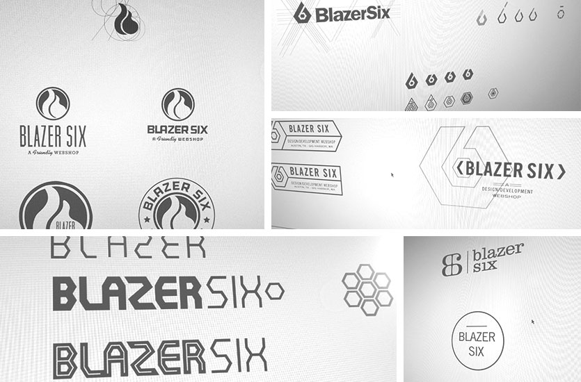
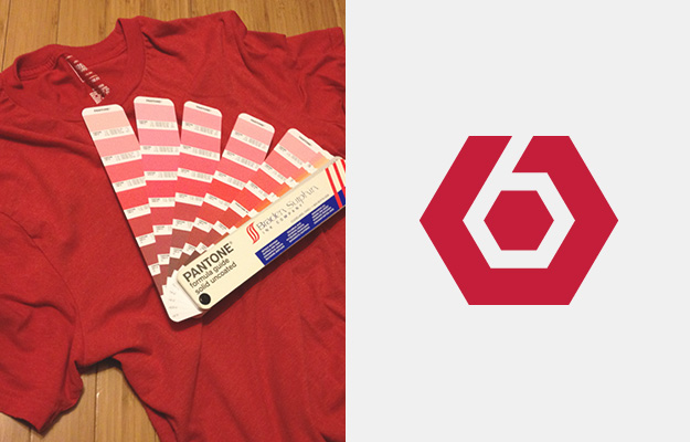
For the mark I initially tried creating a flame, but that was getting back to the same easy association from the previous logo. Somewhere in the process I hit on the hexagon: a polygon with six sides and angles. It’s still an easy association, but less visually apparent and it introduces the workshop element with its connection to a standard nut. A hexagon on its own isn’t unique, and me being unable to get away from the hit-you-over-the-head correlations, decided to create a “6” using negative space. It was a simple solution, but one I thought was a vast improvement.


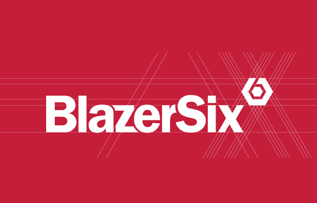
With the icon bolted down, I experimented with various typefaces, at one point even trying something custom using a hexagon as the base. It was more sci-fi than “webshop.” After a few more misfires I settled in on Franklin Gothic, an American classic originally designed by Morris Fuller Benton and named for Benjamin Franklin. It’s a sturdy, constructed type with a lot of the same qualities we were trying to convey. I’d like to think if Franklin Gothic were a TV character, it’d be Hoss Cartwright from Bonanza. Besides that, it’s virtues are touted by Jefferey Zeldman.

With a few modifications – the angles of the “z” and “x” were specifically altered to match those of the hexagon – I felt like we had something that looked a little less like us purposefully exposing our tongues. We hope you like it as much as we do.
Leave a Reply